IFDS: Inside the Engineering Patterns and Component Architecture of iFood Design System
How we connect design and code through rigorous engineering patterns to scale interfaces at iFood
From Divergence to Convergence: The Real Problem
At iFood, we faced a common problem in large-scale technology organizations: a growing divergence between design and code. What started as small visual inconsistencies evolved into a significant gap between design intent and final implementation.
It became clear that we didn’t just need a package update – we needed a structural change in how we think about UI in engineering. The answer to this challenge? iFood Design System (IFDS).
IFDS isn’t just a pretty UI Kit in Figma or a loose folder of components. It’s a comprehensive engineering ecosystem built to scale our design language across all of iFood with technical rigor.
In this post, we’re going behind the scenes and detailing our monorepo architecture, strategic package organization, and the rigorous componentization patterns we’ve adopted.
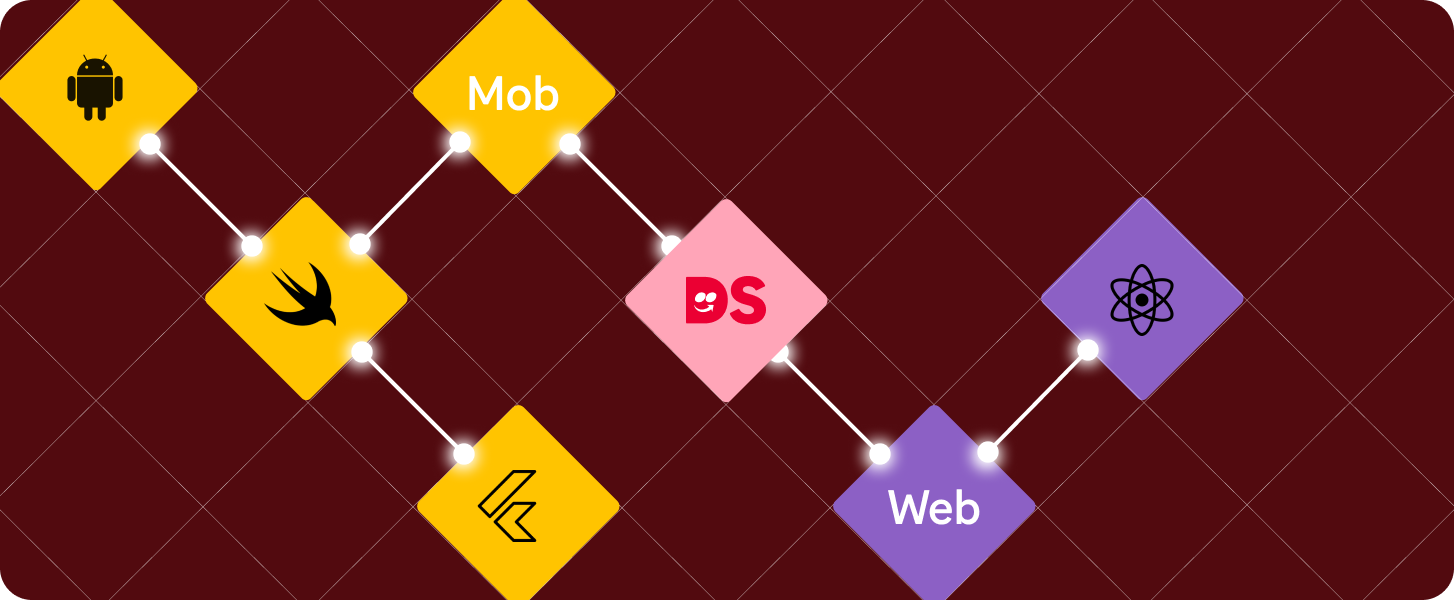
Macro Architecture: Separating Language from Implementation
To serve multiple platforms (Web, Android, iOS, Flutter) without duplicating design logic, we divided our architecture into two conceptual parts:
- iFDL (iFood Design Language): The “soul” of design. Contains platform-agnostic Design Tokens (colors, spacing, typography, shadows). It’s the single source of visual truth that feeds everything.
- iFDS (iFood DS): Component libraries where the “soul” takes shape in specific technologies (like React for Web).
This separation ensures that when the brand’s primary color changes in iFDL, the change propagates via CI/CD (Continuous Integration/Continuous Delivery – a process that automates software integration and distribution) to all consumer platforms automatically.
From Figma to Code: The Theme Generation Pipeline
Design Tokens aren’t just static values in a JSON file – they need to be transformed into specific formats for each consumer platform. In IFDS, this transformation is automated through Style-Dictionary, an Amazon tool that generates themes for multiple platforms from a single source of truth.
Here’s how it works:
- Designers update tokens in Figma using the Figma Tokens Plugin;
- The plugin syncs tokens to the GitLab repository;
- The CI/CD pipeline detects changes and runs the figma-tokens-adapter, which normalizes tokens from Figma format to style-dictionary format;
- The style-dictionary-builder processes tokens and automatically generates:
- CSS variables for Web (
--ifdl-color-brand-primary-default); - TypeScript objects for React (
IFDL.color.brand.primary.default); - XML resources for Android;
- Swift classes for iOS;
- Dart classes for Flutter;
- And more…
- CSS variables for Web (
This means that when a designer changes the brand’s primary color in Figma, that change automatically propagates to all platforms without a single engineer touching the code.
The style-dictionary-builder is configured to generate themes for multiple organizations (iFood, Pago, for example), multiple themes (default, dark), and multiple modes (light, dark), all from the same token source. Generated files are read-only and should never be manually edited. They are regenerated with each token change.
Organization and Scale: Monorepo in Practice
Managing a system of this magnitude requires robust tools. Choosing a modern monorepo (using Nx, which is a monorepo build system – a monorepo orchestration tool focused on performance and scalability of large software projects) wasn’t just about putting code in a single repo, it was about gaining operational efficiency at scale.
With Nx, we gained superpowers in our CI/CD pipeline:
- Incremental builds and smart caching: the system understands the dependency graph and only tests/builds what changed. If I only touched a button, I don’t need to run the entire system test suite.
- Parallel task execution: we run lint, tests, and builds of different packages simultaneously, drastically reducing developer wait time.
- Simplified dependency management: we maintain a single version of React, TypeScript, and other core libs for the entire ecosystem, avoiding “dependency hell”.
Strategic Directory Structure
How do we physically organize hundreds of components? We defined a clear three-level hierarchy that separates fundamentals, global patterns, and product-specific implementations:
ifds/components/
├── shared/             # Reusable fundamentals (Atoms/Molecules)
│   └── web/
│       └── src/
│           ├── Buttons/
│           ├── Form/
│           ├── Layout/
│           ├── Typography/
│           ├── hooks/          # Shared utility hooks
│           └── utils/          # Shared helper functions
│
├── global/             # Corporate patterns (Organisms)
│   └── web/
│       └── src/
│           ├── Communication/  # e.g. Toasts, Banners
│           ├── Navigation/     # e.g. Sidebars, Headers
│           ├── Rating/         # e.g. Rating stars
│
└── product/            # Business domain-specific
    └── driver-app/     # e.g. Components that only exist in Driver App
        └── web/
            └── src/
The Three-Level Strategy
This structure reflects a strategic decision about the scope and granularity of reuse:
- Shared Components (shared/web/src/): the fundamental “dumb” building blocks of the interface (without complex business logic). Buttons, Inputs, Layout Grids, Typography. They are highly reusable and serve as the foundation for everything above.
- Global Components (global/web/src/): more complex UI patterns, usually composed of multiple shared elements, that are still universal to the iFood brand. For example, a Navigation component (Sidebar) is global, but is built internally using buttons, icons, and links from the shared layer.
- Product Components (product/{product}/web/src/): complex organisms highly coupled to a specific business context. For example, a “New Ride Card” in the driver-app. They consume components from the shared and global layers to build an interface that solves a specific business problem.
This division prevents fundamental components from being “polluted” with business rules and ensures that complex patterns remain consistent across products.
Micro Anatomy: The Component Pattern
Moving from monorepo level to file level, standardization continues. In IFDS, creating a component isn’t just about creating a .tsx file.
We defined a rigorous pattern for what constitutes a “Standard Component”. Each component requires a complete structure to ensure that implementation, tests, documentation, styles, and types are all first-class citizens.
Here’s the actual structure of a simple component from the shared layer, like a Button:
Button/
├── Button.tsx           # Main implementation [required]
├── Button.test.tsx      # Unit/a11y tests (Vitest/RTL) [required]
├── Button.stories.tsx   # Storybook stories [required]
├── Button.module.css    # Isolated styles (CSS Modules) [required]
├── types.ts             # TypeScript definitions and public interfaces [required]
├── index.ts             # Public API of the package
This standardization eliminates assumptions. Any engineer joining the project knows exactly where to find logic, styles, or tests.
Our Engineering Pillars
Having an organized folder structure isn’t enough. What really ensures quality and maintenance are the code patterns we apply within these files.
1. Rigorous and Semantic TypeScript
TypeScript is not optional. In IFDS, we take typing seriously to ensure excellent Developer Experience (DX) and prevent bugs.
Our properties are semantic: they describe behavior or intent (variant="primary", isLoading…), never direct style values (color="red", fontSize="14px"...). This gives us flexibility to change the design without breaking consumer applications.
We use type composition in our types.ts file, separating our custom properties from native HTML attributes. Additionally, we wrap all properties with the Prettify utility type to improve the TypeScript autocomplete experience:
// types.ts (Real IFDS example)
import type { ComponentPropsWithoutRef, ReactNode } from 'react';
import { Prettify } from '../../utils';

// Semantic props from our Design System
export type CustomButtonProps = {
  children?: ReactNode;
  variant?: 'primary' | 'secondary' | 'text' | 'link';
  isLoading?: boolean;
};

// Final composition with native HTML button props, excluding what we override
// Prettify improves autocomplete experience in TypeScript
export type ButtonProps = Prettify<
  CustomButtonProps & Omit<ComponentPropsWithoutRef<'button'>, keyof CustomButtonProps>
>;
2. Styling: CSS Modules + Mandatory Tokens
The biggest enemy of consistency in a Design System? “Magic numbers” in CSS. In IFDS, we use CSS Modules to ensure isolated scope and avoid class name conflicts in micro-frontends. But the golden rule is: always use design tokens, never hardcoded values.
These tokens are generated from Figma by iFDL via style-dictionary. Engineers don’t “create” colors, we consume them.
Wrong (Hardcoded):
.button {
  padding: 16px;
  background-color: #ea1d2c; /* iFood's red today, maybe not tomorrow */
  border-radius: 8px;
}
Right (Tokenized):
/* Button.module.css */
.button {
  border-radius: var(--ifdl-border-radius-re);
  padding: var(--ifdl-spacing-scale-12);
  font-family: var(--ifdl-font-family-ifood-body);

  &.variant-primary {
    &.state-disabled {
      color: var(--ifdl-background-color-on-disabled);
      background-color: var(--ifdl-background-color-disabled);
    }

    &:not(.state-disabled) {
      color: var(--ifdl-background-color-on-brand-primary);
      --background-color: var(--ifdl-background-color-brand-primary);
    }
  }
}
3. Architecture Pattern: Inversion of Control (IoC) and Composition
To create truly reusable components at scale, we need to avoid “React Prop Drilling Hell” – where a parent component receives dozens of props just to pass them to internal children. We adopted Inversion of Control (IoC) through the Composition pattern. Instead of a monolithic component that tries to do everything via configuration props, we offer sub-components that developers assemble.
This allows flexibility while maintaining visual consistency. A classic example is our Dialog component:
// Composition example (IoC)
// The parent Dialog component doesn't need to know what's inside Footer.
<Dialog status="open" onClose={close}>
  <Dialog.Header title="Confirmation" />
  <Dialog.Body>
    Do you really want to delete this item?
  </Dialog.Body>
  <Dialog.Footer>
    <Button variant="tertiary" onClick={close}>Cancel</Button>
    <Button variant="primary" onClick={confirm}>Confirm</Button>
  </Dialog.Footer>
</Dialog>
Quality is Non-Negotiable
Finally, standardization extends to quality assurance in the pipeline. A component in IFDS is only considered “ready” and merged if it includes:
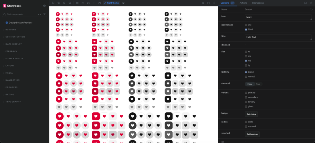
- Storybook Stories: mandatory for visual documentation, visual regression testing (Chromatic), and isolated development.
- Comprehensive Tests: We use Vitest and React Testing Library. We don’t just test if it “renders” – we test user interactions, loading states, and error behaviors.
- Accessibility (a11y): Static checks (eslint-plugin-jsx-a11y) and automated tests in CI to ensure we’re delivering inclusive interfaces.
Summary of the iFood Design System
Migrating from a legacy library to IFDS required a serious commitment to software engineering. This organization, from the macro structure of the monorepo with Nx, through the strategic division between shared, global, and product, to the micro structure of files and TypeScript/CSS patterns, isn’t bureaucracy. It’s what ensures the consistency, maintainability, and scalability we need for dozens of product teams at iFood to build interfaces quickly without reinventing the wheel.
The automated token pipeline, from Figma to code, through style-dictionary, ensures that design changes automatically propagate to all platforms, eliminating drift between design and implementation.
Now that we’ve established the technical foundation, our focus turns to the adoption and continuous evolution of the system. How do you organize the distinction between generic and product-specific components at scale? Share in the comments!

Augusto Sandim
Software Engineering
Augusto Sandim trabalha como Engenheiro de Software no iFood. Ele é graduado em Ciência da Computação, é do Mato Grosso do Sul e adora andar de BMX.
Construa o futuro no iFood
Estamos sempre em busca de desenvolvedores, designers e cientistas de dados apaixonados para nos ajudar a revolucionar a experiência de entrega de alimentos. Junte-se à iFood Tech e faça parte da construção do futuro da tecnologia alimentar.
Conheça nossas Carreiras
Você também pode gostar de ler
Ler mais sobre Front-end

Conheça outros Autores
Cada artigo é resultado da visão e expertise dos nossos autores. Veja quem contribui com nosso blog: